
Blending and Glazing Tutorial
So here is a QUICK tutorial my friend from Legion of the Cow made for me (they will have more to come soon!). I found this lesson on glazing pretty useful for making my transitions smoother (and less cake batter like). The only thing that would have made the tutorial better is if he gave it to me earlier!! Maybe then I could have avoided my frustration attack, having to restart the Judge... and save my super clean :P
In this tutorial we attempt to explain the process of blending and glazing, and how the two are used in conjunction with each other to create nicer results!
First things first, if you are brand new at this, or have never attempted this stuff, that’s great! It will be rocky at first, but if you keep at it, and keep trying to figure out why things aren’t working or even what makes them work, you can begin to control your painting and your brush much much more than ever before!
So first things first, when you look at the diagram you will wonder what all the %s and lines and jags are, don’t worry, I will break it all down for you.
Now, to start things off, we have Fg 1. In this diagram there are 4 brush strokes with a percent next to them. These percents and corresponding colour consistencies have no direct relation to your water to paint mixing ratios, the reason being is paint out of the bottle is not 100% pure opaque colour, its pre-thinned and depending on the paint brand you will have a different starting point to work from.
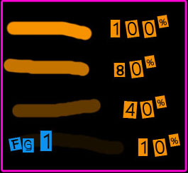 The object of these percents is to illustrate to you just what is going on when you thin your paints and how you can use this information to apply it to better understand blending and glazing.
100% colour is pure, intense and very opaque, you won’t see any of that black under layer(my background or your possible primer/basecoat) showing through.
80% is when we thin our paints a little bit. You can see a bit of that black background showing through which causes our orange to appear a bit more “black”, or rather our black to appear more orange. This is what you would basecoat with, it covers very well still, it is thinned so it wont cover up your details either. This basecoat will require multiple layers, and if you try to put an orange over black, you will find it takes a lot of layers.
40% is well thinned paint, this is a good quick blending type consistency because it maintains a fairly strong effect over the black basecoat, while still being quite transparent.
10% may appear to be nonexistent on this page, well it is there just very very faint. This has such low impact on the black that it will take time to build up to that pure orange, but because it has such low impact it means you can control your blending more easily because each stroke has less impact on the final result.
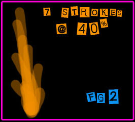 Fg2 shows us an example of blending with a well thinned paint looks like. This is generally what a quicker blend, or army level blending would look like. It doesn’t take much time to put on 7 layers because thinner paint dries faster, and with so few layers and such large contrast between the layers you will get a transition much quicker, it just won’t be quite as smooth as it could be.
To create the transition you will notice how each stroke starts at a different spot, in this case, each stroke starts at a lower position than the one before. If you start every stroke at the same spot you will just create a flat colour. We are affectively using the basecoat as the first part of our gradient. So when we apply thinned paint overtop in these successive layers, we blend from the basecoat, towards our intended colour which is what creates our gradient.
 Fg3 shows us the same as Fg2, except now we drop the consistency down to a much thinner consistency, our example of 10%. If you shrink the image(or step back from the image), it’s very difficult to see the transition lines between each stroke of paint. This is because we have a much softer colour, in more layers, so our transition is much more subtle, yet at the same time it is much more profound than the contrast in Fg2 because there is more transitioning occurring. By using more layers or more diluted paint we can reduce the speed that which our colour transitions, this allows us to create a much longer gradient which becomes much more noticeable, yet appears more smooth.
Now, we know we aren’t going to be blending black to orange very often while painting, and we know that we aren’t just going to be doing one layer “blends” so how do we take this concept and put it into play while highlighting and shading?
Feast your eyes on the big sphere.

We start with 7 different pre-mixed tones of colour, that’s it.
We have 3 highlights, progressively brighter, a base colour and 3 shades, progressively darker. NOTE: because we have a black background I used a blueish darkest colour that is actually lighter than it should be, its merely to help you see it!
First step is simple, basecoat it! Remember basecoats are diluted less!
*All my layering is done at 20% instead of 10%, I did this just so I could be done a bit faster and so you could still see the lines of each of my strokes.
Second step is up to you, either start with a highlight, or a shadow, in this case the 1st highlight or shadow, to save headache let’s assume I start with highlighting. Now the object of this colour is not necessarily to achieve contrast, in fact if you are blending with very thin paint, you won’t see much happening at all, this is where patience and trust comes in. So what this colour does is it covers ground, it’s your foundation for highlights, so you want to cover as much ground as possible, and anything that would be highlighted at all, or receive any
light period, should receive this tone. In this example I used about 6 layers, with the same idea as Fg2 and
Fg3 of successive layering so that you do not cover the exact same area each time.
**I have placed some coloured lines showing how much area I covered with each tone of colour. The darker blue show the first highlight, the green show the 2nd highlight, and the pink shows the brightest highlight.
Next step is the 2nd highlight, this one should be a bunch brighter than the 1st because this one is the benchmark between it and your brightest colour which should be brighter than you think in most cases. In many cases how much contrast a surface has depends on its material or texture, but that’s more complex stuff and we aren’t there yet, so don’t worry too much about that!
The final step of highlighting, is adding that brightest highlight, this is what really creates the contrast, so leave this to the very brightest spots and edges. In some cases, like when painting edges, you will need to use a less diluted paint so that it doesn’t take ages, and wont just roll off the edges.
The same method and process applies for shading, so I will skip that.
The next stage is the glazing stage, because it often occurs during the process that you may cover too much or too little ground with each tone of colour and/or you may want to smoothen your brush strokes. Now glazing requires very thin paint, and even if you choose a less diluted consistency to create the initial blend, like Fg2, a glaze must be in the area of 10-20% to do its work. Glazing can sometimes require many layers, if for example you are softening transitions or fewer layers if you are simply adjusting the ground each tone covers.
We covered too much of our basecoat. So we glazed between basecoat and highlight 1, and between basecoat and shade 1, this softened the transition as well as allowing us to regain the initial basecoat colour. The diagram does not show yellow blocks for these areas. Generally speaking never cover two or more tones of colour when glazing as it will reduce contrast by making all 3 tones similar. You want to cover only a portion of each of the two tones, otherwise you will essentially erase one for the other.
We then glazed a bit with highlight 1, between highlight 1 and 2 shown by the yellow block. Then we did the same with highlight 2 between highlight 2 and the brightest shown by the yellow block. The same applies with the shades.
As you can see, it’s not a super smooth result, but you achieved transition from light to dark and at a distance it appears to be much smoother. This is a quicker method for a tabletop hero character.
In closing: I hope that this tutorial helped you better understand the concepts behind blending and glazing and how you can achieve it. It all takes time to learn but hopefully the idea clicks a bit easier for you now.
Thanks and good luck!
No comments:
Post a Comment